eBay for Chrome
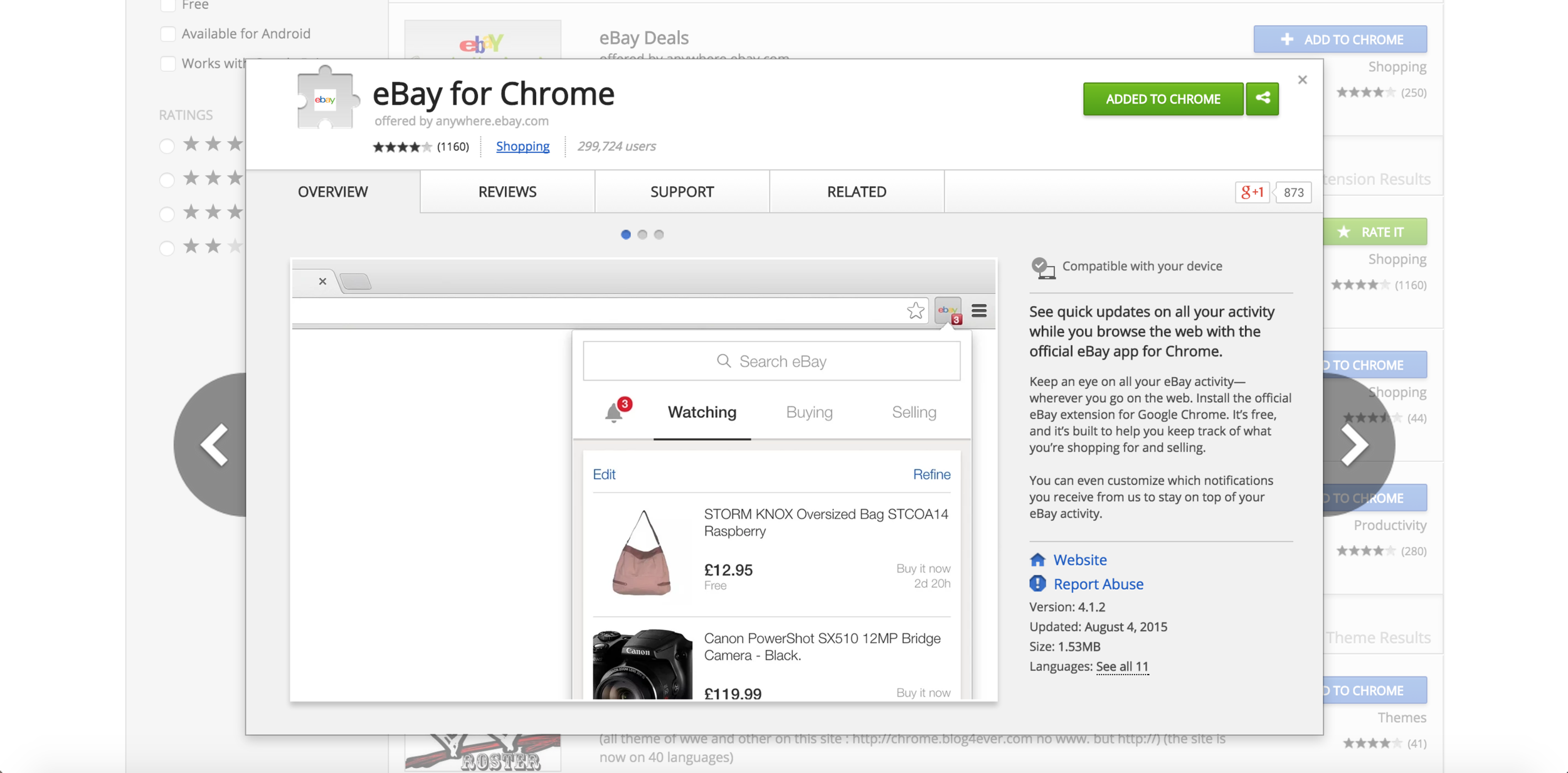
eBay for Chrome is an extension for customers to keep track of their eBay activity at a glance without having to navigate the eBay site. It has a loyal user base of 300,000 active monthly users and generates a significant GMB. Per Google, it needs to be a single purpose app- the focus of the app is "my eBay", i.e watching, buying, selling activity as well as notifications of this activity.
My Role
I was the sole designer on this project, working with a product manager and an agency development team. I was involved in the entire re-envisioning of this app from the start, creating sketches, wireframes and prototypes as well as testing with users.
The Design
Simplification is the essence of this design- eBay is a pretty complex marketplace and the interface reflects this complexity. Simplifying with a clear understanding of users needs and goals and making this a truly single purpose app with a focus on my eBay was the intent and the challenge. This app also reflects the new design direction for eBay, simple, clean, and usable. The user base is primarily an existing one comprising of lower volume sellers, and low and high volume auction heavy buyers.
Initial designs incorporated more features based on some older data, but as the designs progressed, simplicity became the focus and many features were stripped to let the app serve customers in the best way possible.
Some of the features and interactions that contribute to this experience are:
Tabbed model for easy navigation between activity sections
Clear item statuses for every item
Clear information hierarchy with item titles, price and supporting information for easy scannability
Features like separate pages for sections for high volume users with features like edit and refine (filtering and sorting)
Process and iterations
The first step was to analyze the elements of the existing browser app through both data and feedback from the browser app user community site to determine if it met an actual user need. The app had grown organically (much like the eBay website) and many features (like Deals) were added on in the hope that they would drive GMB rather than improve the customer experience.
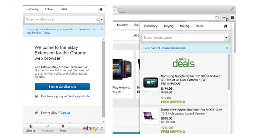
The Original app
After analyzing the requirements, the next step was to put some Information architecture together, focusing on the navigation. Since this was to be a single purpose app, the key elements decided upon were the "my eBay" part of the app, i.e, watching, buying, and selling and notifications about items. At this stage, the navigation models had some sort of a menu for non-item related information (links to important areas of the ebay site along with customer support links and profile information) and a tabbed model for the item related information. Dropdown filters were explored for he Watching, Buying, and Selling sections.
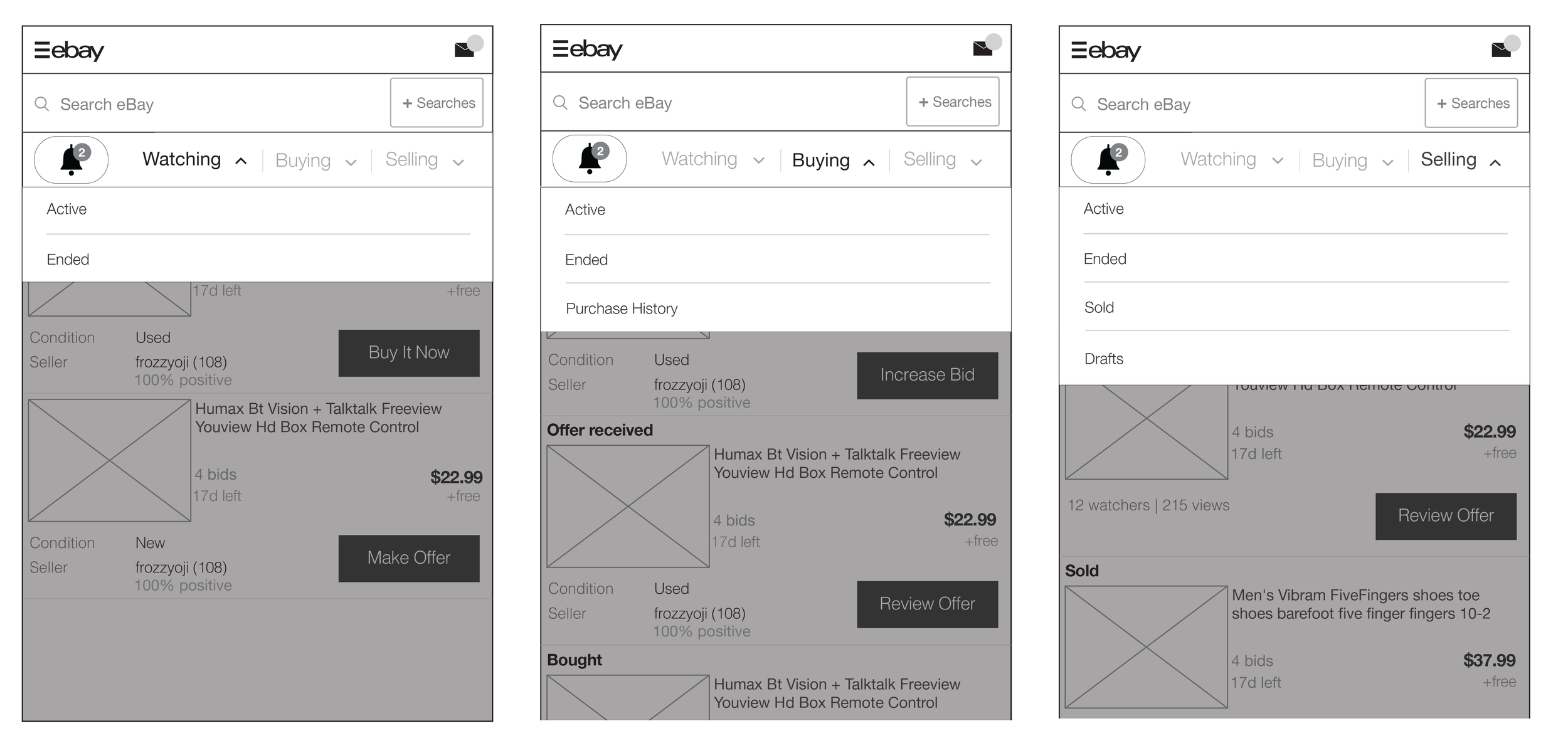
The next level of iterations included getting into the details of item cards from both an informational and interaction standpoint. The mobile effort (that I was also designing) was going on in parallel, and since this is a very similar form factor despite not being primarily a touch interface, the information hierarchy in the item cards was similar. Contextual buttons were explored as a means of letting the user act on their items at the right moment depending on the status of the item.
Selling explorations included a progressive UI for low and high volume sellers, i.e, high volume sellers can keep track of their items via a simple dashboard and to-do's and well as filter through their items. A similar approach was adopted for the final product.
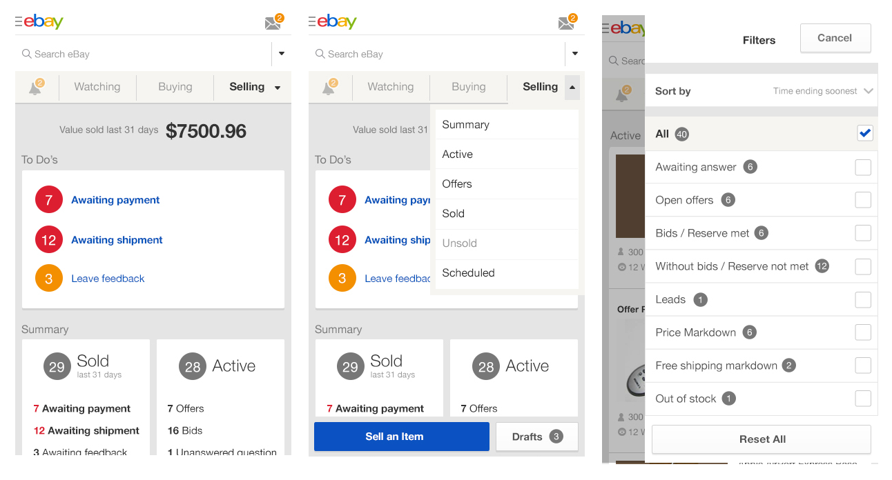
After studying more data and analyzing user behavior, we determined that the navigation could be simplified further, with a focus on search and the tabs on top and getting rid of the hamburger menu while adding a bar at the bottom with a only a few essential links.
Simplifying the navigation also helped simplify the search experience. Searching for an item takes the user to search results on the site.
Final design and build
Screenshots of July 2015 release